The brown delivery van pulls away from your doorstep, leaving behind a package that weighs more than you expected. Inside that unassuming shipping box lies months of obsessive attention to detail, countless prototypes, and a level of perfectionism that borders on the unreasonable. This is the story of what really goes into creating your Oishya knife – not just the blade, but everything that surrounds it.
From Japana to Oishya: When Names Matter More Than You Think
Before we dive into wooden boxes, their incredible content – your beloved Japanese knives and their steel specifications, there’s something you should know. If you’ve been following us since the early days, you might remember us by a different name. For six years, we traded as Japana. The rebrand to Oishya in January 2022 wasn’t just a marketing decision (Google browser was always trying to correct people when typing Japana, by suggesting “Did you mean Japan”) – it was mainly a fundamental shift in how we understood our own mission.
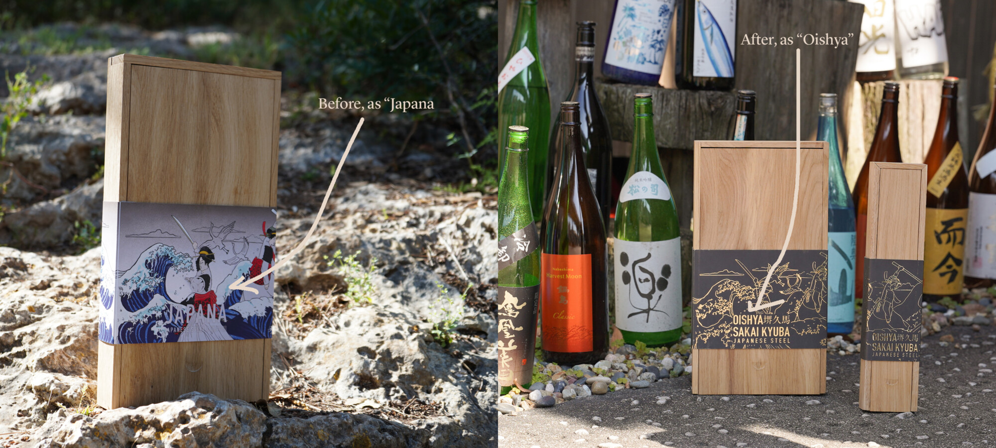
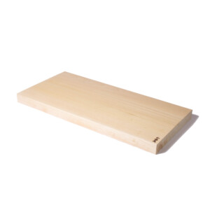
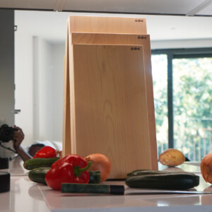
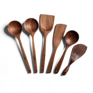
Japana served us well in the beginning. It was clear, direct, and told customers exactly what to expect: products from Japan. But as we grew, that name started feeling like a cage. Our core Japanese knives have always been, and will always be, crafted in Japan by master blacksmiths – that’s where the quality and history simply can’t be beaten. However, we began expanding our product line to include other kitchen essentials that make cooking more pleasant: wooden cutting boards, serving trays, trivets, magnetic knife racks and strips to store those delicate blades properly. And we wanted to craft them close to our home, to maintain our sustainability promise and be in control of the quality – hence we decided to make all of our wooden products (but aomori hiba boards that are imported from Niigata, Japan) in Europe.
Our focus remained on pure, natural materials – wood, metal (steel), and stone (porcelain and marble) – but we were no longer exclusively sourcing from Japan. We were curating experiences and building relationships with craftspeople across Europe, discovering that exceptional quality knows no borders when it comes to these complementary pieces.
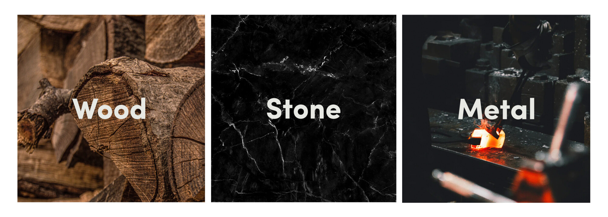
The breaking point came when we launched our wooden cutting boards and storage solutions. Beautiful pieces, crafted by family-run workshops in Europe using traditional techniques that rivalled anything we’d seen from Japan. But how do you explain European craftsmanship for kitchen accessories under a brand called Japana? And then, what does “Japana” even mean? A female part of Japan? A typo in Google search bar? The cognitive dissonance was becoming impossible to ignore, even though our knife heritage remained firmly rooted in Japanese tradition.
Our customers were evolving too. They weren’t just buying Japanese knives. They were investing in a philosophy about cooking, craftsmanship, and the joy of creating something beautiful for the people they loved. The name Japana felt too narrow for that broader mission.
When we discovered “Oishii,” everything clicked. Often mistranslated simply as “delicious,” the word actually describes the entire experience of enjoyment connected to eating and drinking. It’s not just about taste – it’s about the laughter around the dinner table, the satisfaction of perfectly diced vegetables, the pride in serving something made with your own hands. To us, Oishya became the embodiment of enjoying the experience of making home-cooked meals and creating joy through food.
The Art of Eva
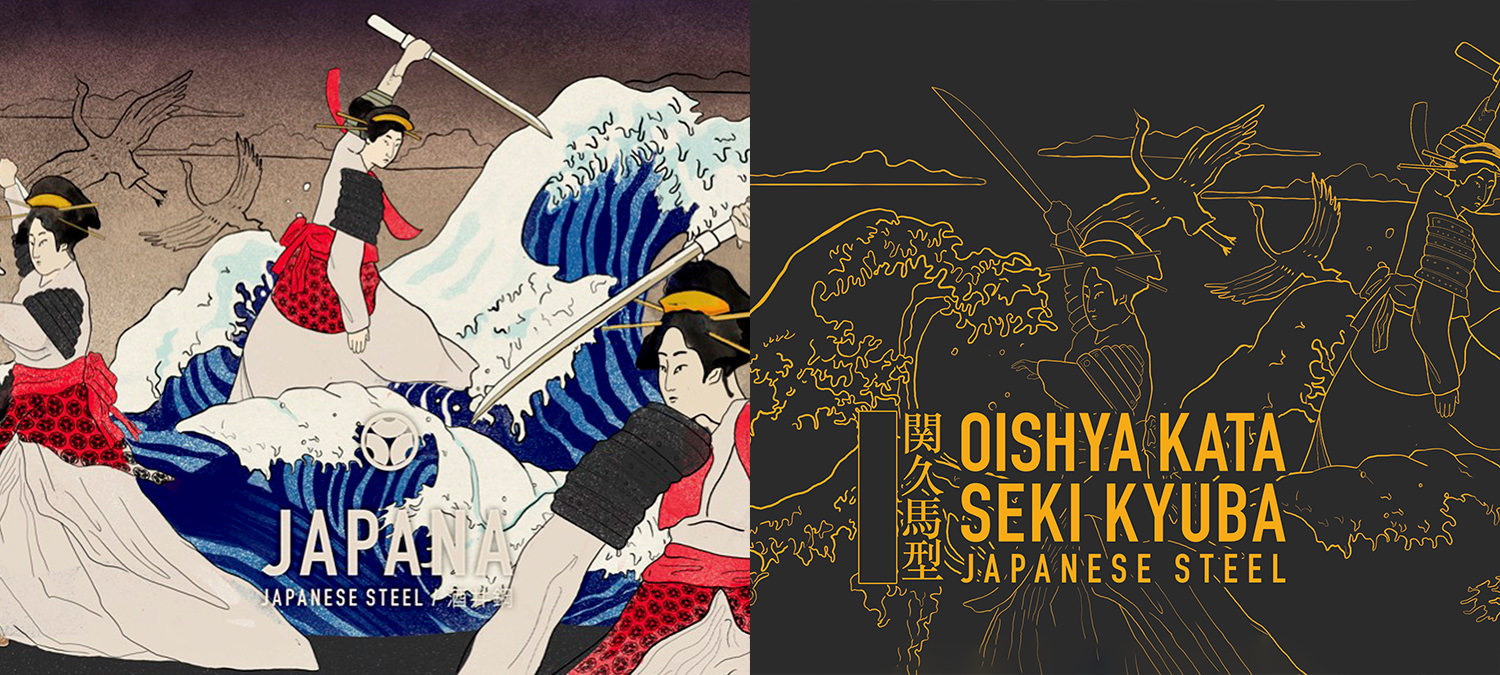
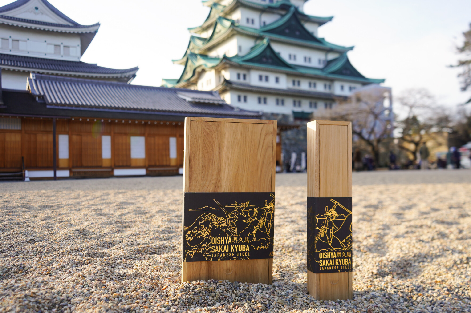
The rebrand meant more than just a new name – it required a complete visual reimagining. We commissioned local artist Eva to create our illustration strips, and her work became central to how we tell our story. Eva’s designs aren’t just decorative; they’re deeply rooted in Japanese culture and our company’s founding philosophy.
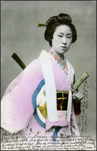
Central to Eva’s artwork are the onna bugeishas – the female samurai warriors of feudal Japan. These remarkable women challenged traditional gender roles, mastering martial arts and weaponry alongside their male counterparts. Their story resonated deeply with our founders, particularly Kamila, whose search for a quality Japanese knife for her boyfriend had revealed how male-dominated the knife world could feel.
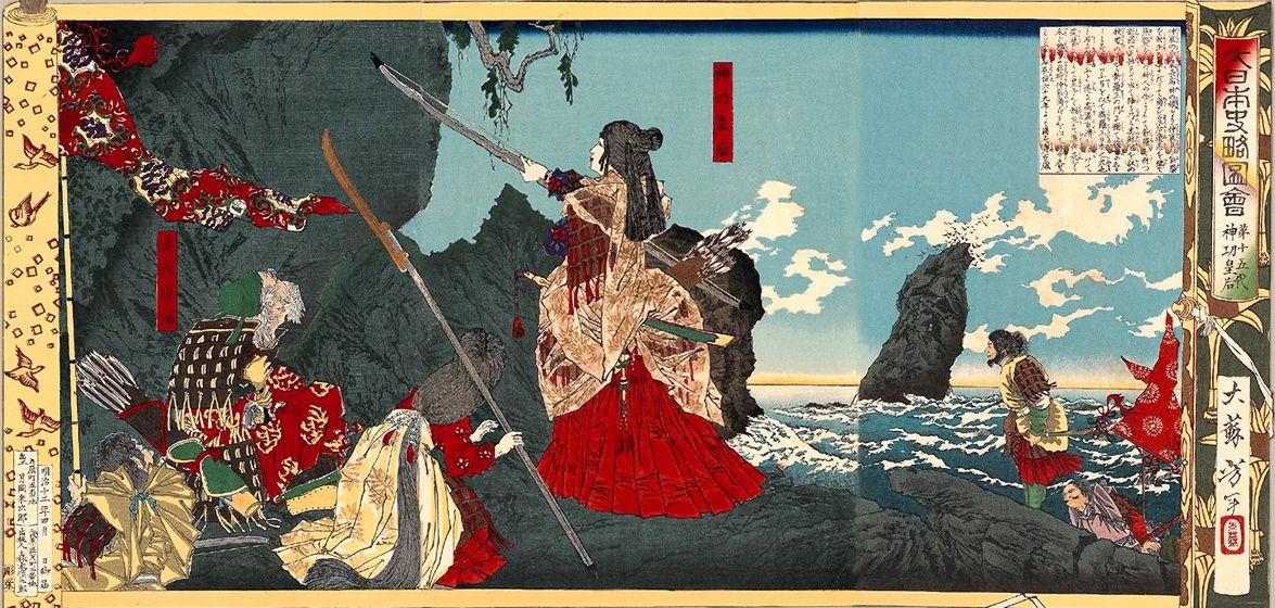
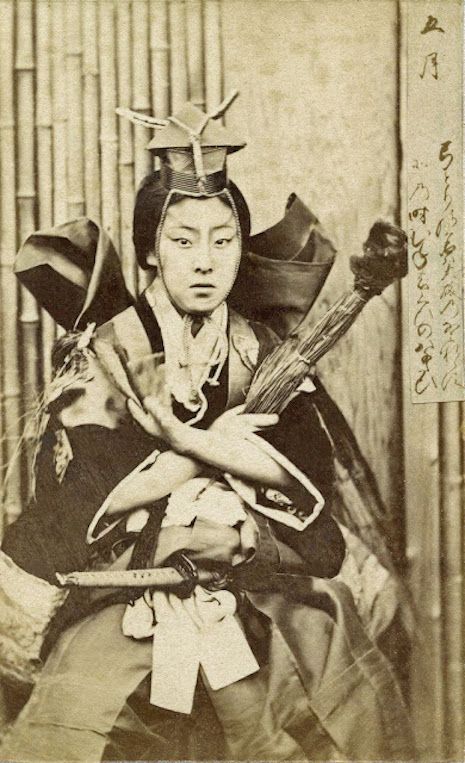
Eva incorporated these warrior women into our visual narrative alongside other powerful Japanese cultural symbols. The tsuru cranes appear throughout our packaging, representing longevity and good fortune – perfect symbols for knives designed to last generations. Hokusai’s Great Wave of Kanagawa flows across our illustration strips, suggesting both the power of nature and the flowing movement of skilled knife work.
Our Oishya kamon (family crest) features three bugeisha fans arranged in a circular pattern. In Japanese culture, the fan represents not just grace and beauty, but also the hidden strength that lies within apparent delicacy – much like our knives, which appear elegant but contain devastating cutting power. The three fans honour the three fundamental aspects of our philosophy: craftsmanship, tradition, and innovation.
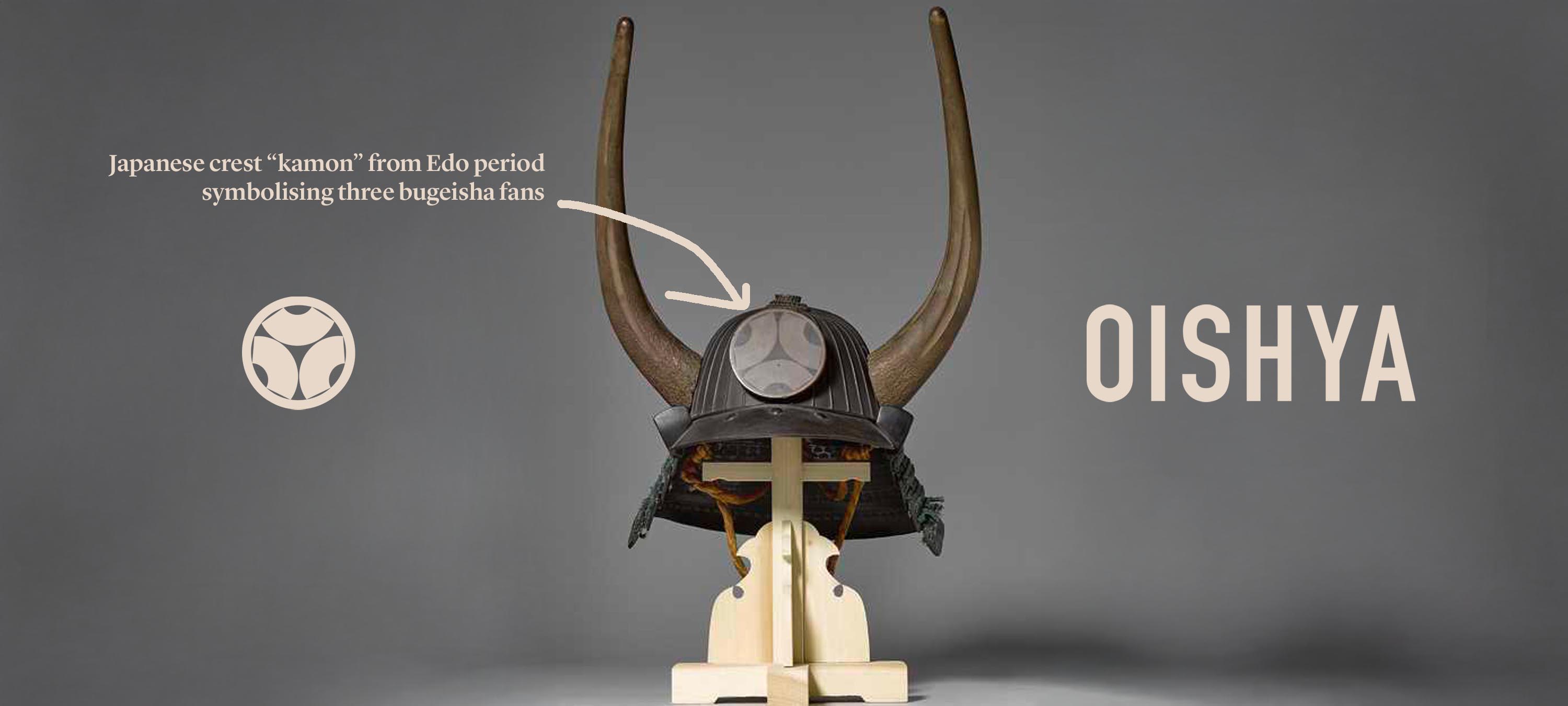
Every illustration strip tells this story whilst maintaining the unique character of each knife line. Eva spent months working with us to ensure the artwork captured both the martial heritage of Japanese blades and the joy of modern cooking. The result is packaging that functions as both protection and storytelling – each box becomes a small piece of art that connects your kitchen to centuries of Japanese tradition.
The rebrand meant new packaging, new illustrations, new everything. Every wooden box had to be updated. Every illustration strip needed redesigning around Eva’s artistic vision. The hanko seals required modification. It was expensive, time-consuming, and occasionally heartbreaking to let go of five years of brand equity. But it was also liberating. For the first time, our name and visuals truly reflected who we were becoming rather than where we started.
The Great Box Disaster of 2023
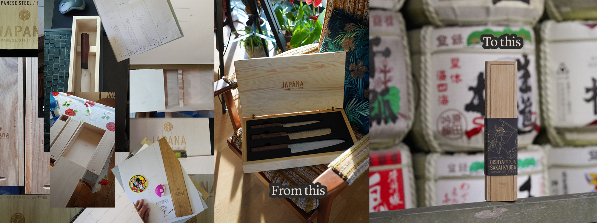
Now, about those wooden boxes. Let’s start with what you might consider the simplest part of the entire operation. How complicated could a wooden box be, right? Well, after eighteen failed prototypes, three completely redesigned interiors, and one memorable incident where an entire shipment of boxes collapsed under their own weight, we learnt that “simple” and “perfect” rarely go hand in hand.
Our first boxes looked beautiful in the design studio. Oak wood, clean lines, that satisfying weight when you lifted them. The sort of packaging that made you feel like you were unwrapping something precious. Then we put knives inside and discovered our first painful lesson: precision instruments demand precision packaging.
Knives were sliding around like loose change in a pocket. Blades chipping against the wood, handles getting scratched by the very boxes meant to protect them. We’d spent months perfecting steel that could shave paper, only to watch it get damaged by its own presentation. The irony was devastating.
Version two featured custom foam inserts. Perfect fit, total protection. The knives sat like crown jewels in their perfectly moulded foam beds. Then someone on our team pointed out the glaring contradiction: here we were, a company built on natural materials and traditional craftsmanship, wrapping our products in plastic foam. It felt like serving well bottled wine in a paper cup.
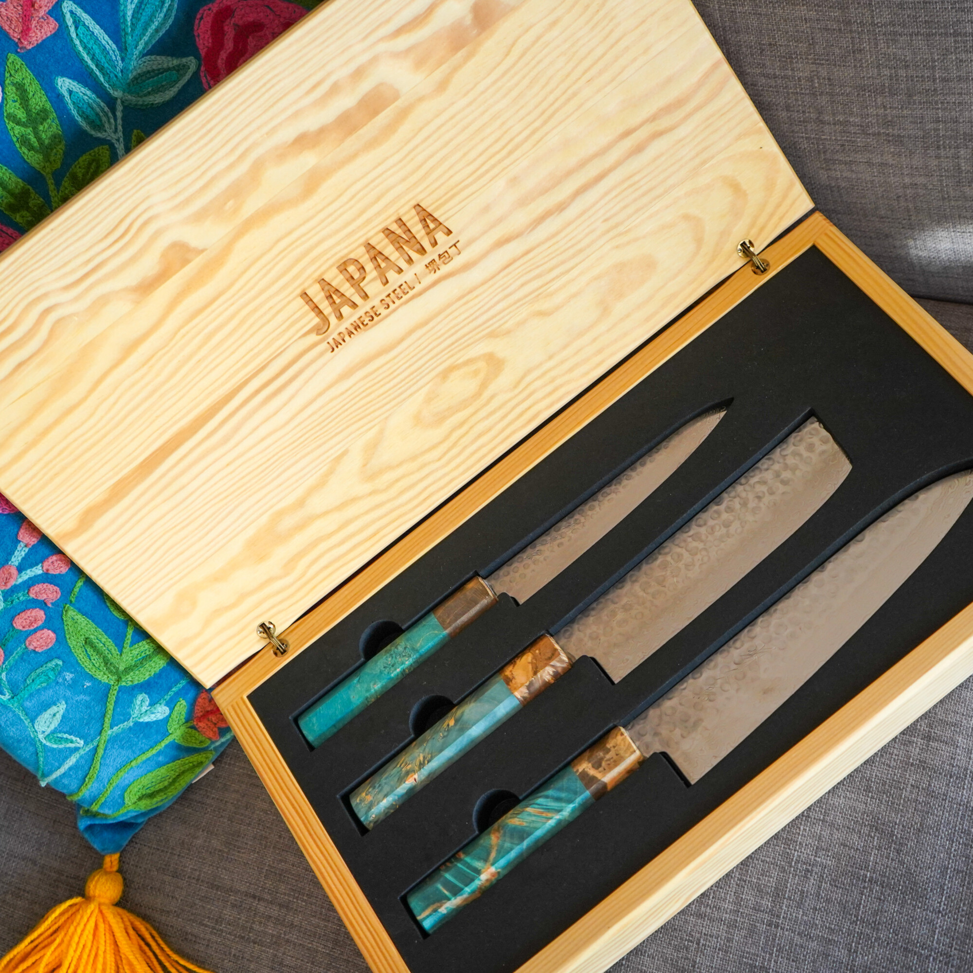
The decision to eliminate all plastic packaging wasn’t just philosophical, but mostly it was practical. Our customers were investing in lifetime tools, heirloom-quality pieces they’d pass down to their children. Why surround them with materials that would crumble to dust in a few decades? If we were serious about sustainability and craftsmanship, every component needed to reflect those values.
Back to the drawing board. Version three through seven were variations on wooden inserts, felt lining, and different natural cushioning approaches. Each iteration taught us something new about the physics of protection and the economics of shipping.
Version three was too heavy. Shipping costs went through the roof, making our knives prohibitively expensive to send internationally. Version four was too light – boxes arrived looking like they’d been through a blender, with loose components rattling around inside. Version five was too shallow for our larger gyutos. Version six was too deep for our petty knives, making them look lost in oversized boxes.
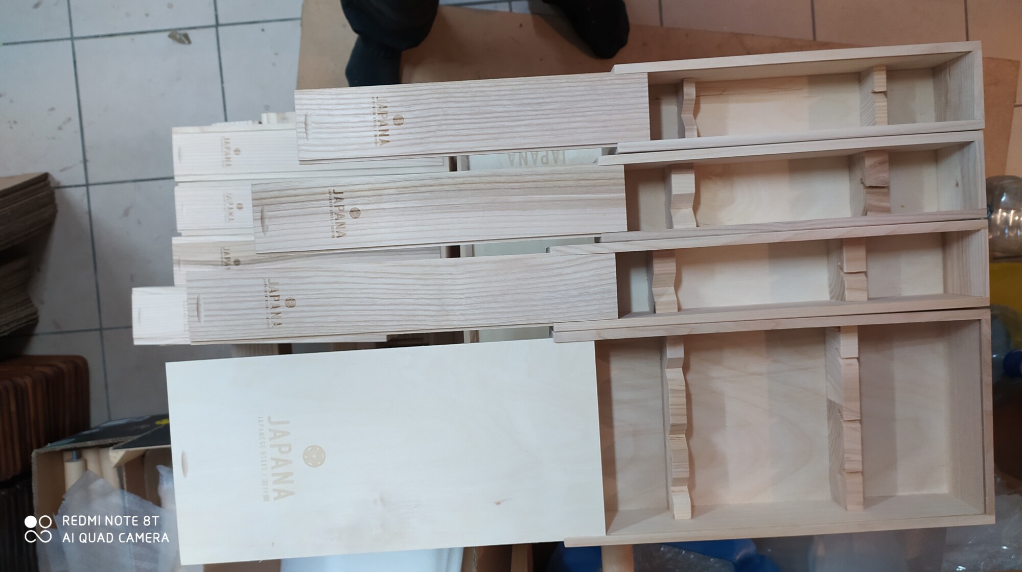
The breakthrough came when we stopped thinking like designers and started thinking like engineers. Every measurement mattered. The interior depth needed to accommodate our longest blade plus handle with exactly 3mm clearance – enough to prevent bouncing during shipping, not enough to allow sliding that could cause damage. The wood thickness required precise calculation to protect contents without adding unnecessary weight. The corner radius had to prevent stress concentration that could cause cracking during transit.
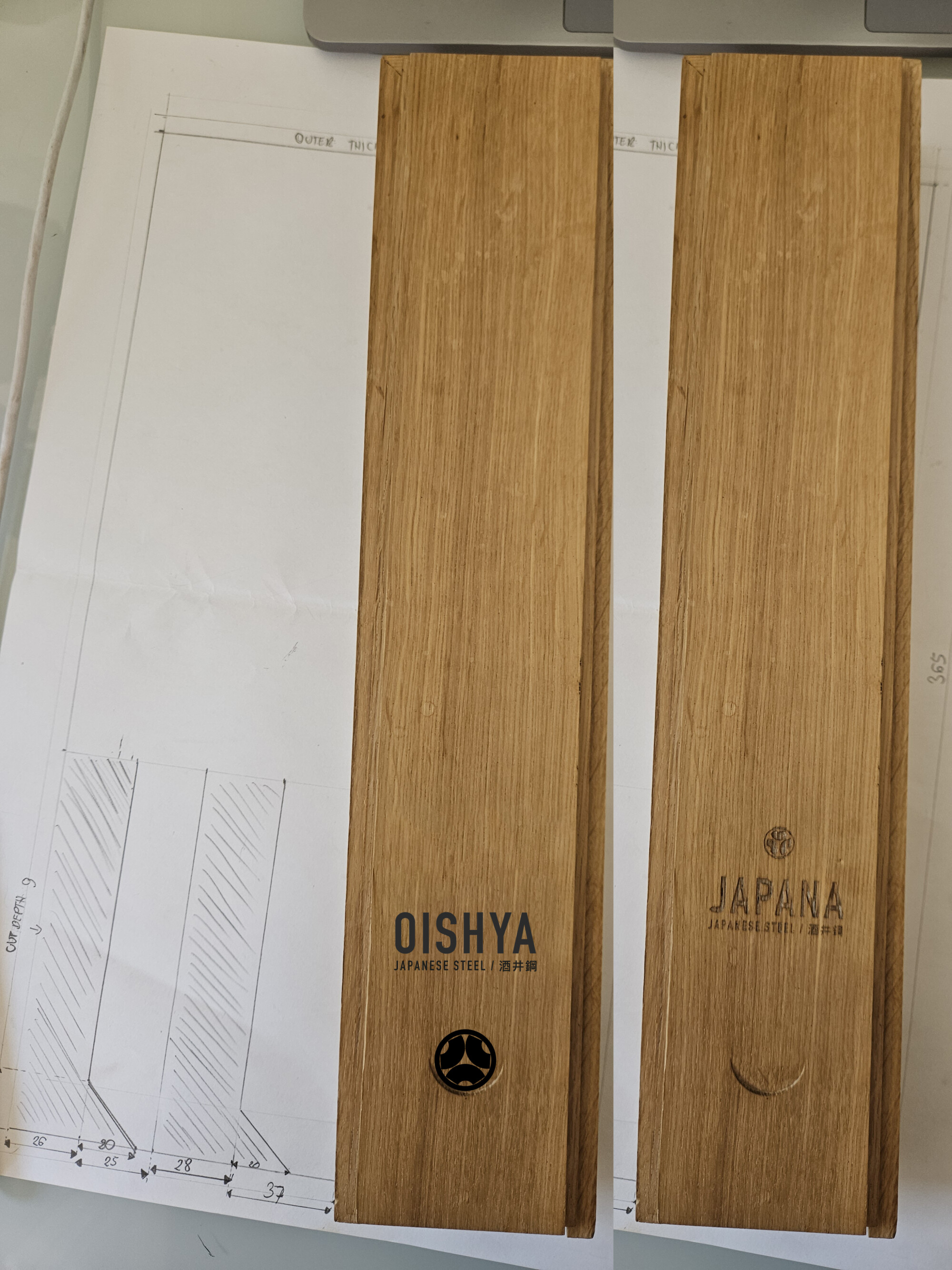
We developed detailed technical drawings for three box versions, each optimised for different knife categories. Version 1 for our petty knives and shorter blades. Version 2 for standard gyutos and santokus. Version 3 for our full-length gyutos and knife sets. Every dimension calculated, every angle measured, every material thickness specified to the millimetre.
The interior components presented their own challenges. We experimented with felt lining, but found it compressed over time and lost its protective properties. Cork worked well for cushioning but proved too expensive for large-scale production. We finally settled on a system of precisely cut wooden inserts with strategically placed contact points that cradle each knife without constraining it.
Each box needed to accommodate Eva’s illustration strips perfectly. The artwork couldn’t just be slapped onto any surface – it required precise positioning to ensure the visual story unfolded correctly during unboxing. The strip attachment points had to be engineered to hold securely during shipping whilst allowing clean removal without damaging the oak surface.
The Multiplication Problem
Here’s where things get deceptively complex. From the outside, we might look like a company with a manageable product range. Six knife lines, handful of styles each – how hard could inventory and packaging be?
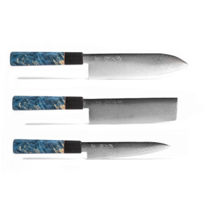
Then reality hits with mathematical precision: KYU line with four knife types, each in three colours. KATA with four types, three colours. RYU with four types, three colours. SHIN with five types, three colours. NIJI with four types, three colours. PAN with one type, three colours. Plus sets – Santoku/Nakiri/Petty combinations, Bunka/Nakiri/Petty variations, Gyuto/Nakiri/Petty options.
Suddenly we’re looking at over 200 individual SKUs, each requiring its own precise packaging solution. The box that perfectly fits a KATA Santoku in Mediterranean Blue needs identical interior measurements to the one for a KATA Santoku in Olive Green – but different measurements than a SHIN Gyuto in any colour. The set boxes require completely different engineering to accommodate multiple knives without them touching each other.
This is why standardisation became our obsession. Three box sizes, each with modular interior components that can be reconfigured for different knife combinations. It sounds simple until you’re lying awake at 3 AM wondering if the wooden separator for the NIJI Bunka will interfere with the handle clearance for the RYU Petty in a mixed set configuration.
We created detailed engineering drawings for every possible combination. Each illustration strip had to be sized precisely for its corresponding box, with Eva’s artwork scaled appropriately for different box dimensions whilst maintaining visual integrity. The foam separators – the tiny pieces that prevent knives from touching each other in multi-knife sets – required their own engineering specifications.
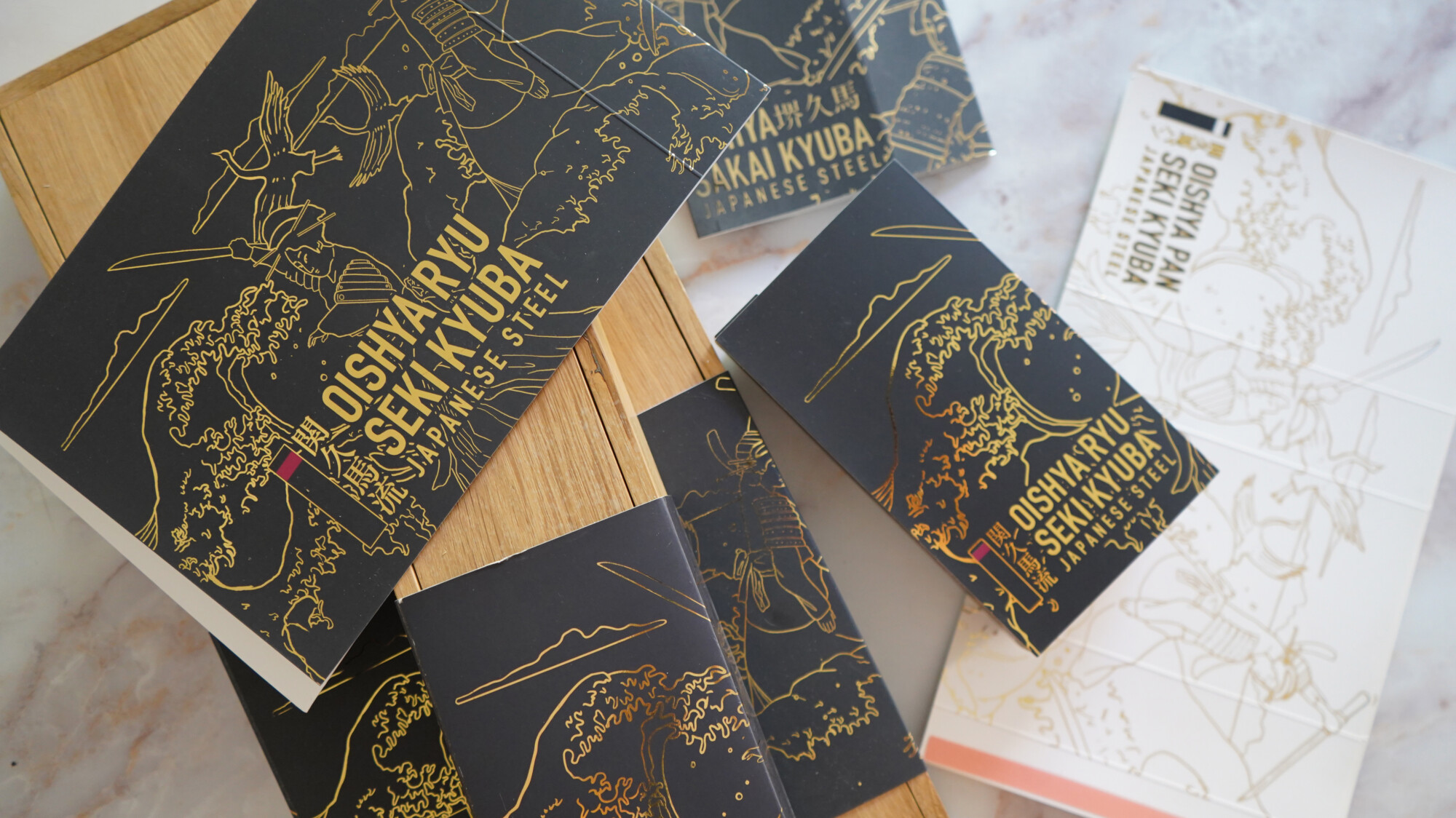
The quality control nightmare multiplied accordingly. A single production run might include twelve different box configurations, each requiring verification that internal dimensions matched the intended knife configuration. A 2mm error in interior width could mean the difference between perfect presentation and rattling disappointment.
The Karate Belt Philosophy
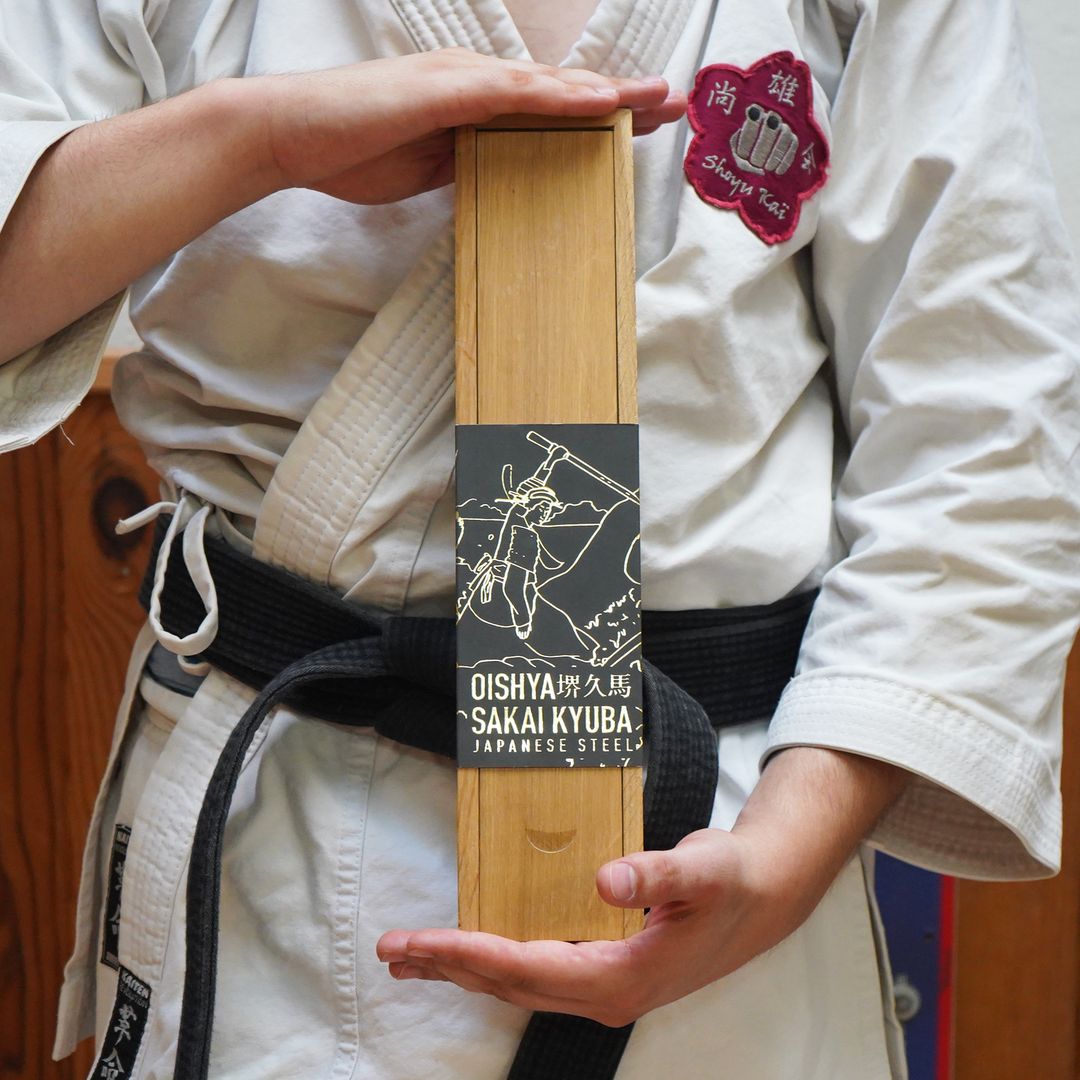
The naming system for our lines didn’t happen by accident. When we started expanding beyond our original KYU line, we realised we needed a framework that made sense – not just to us internally, but to customers trying to understand the progression of quality and complexity.
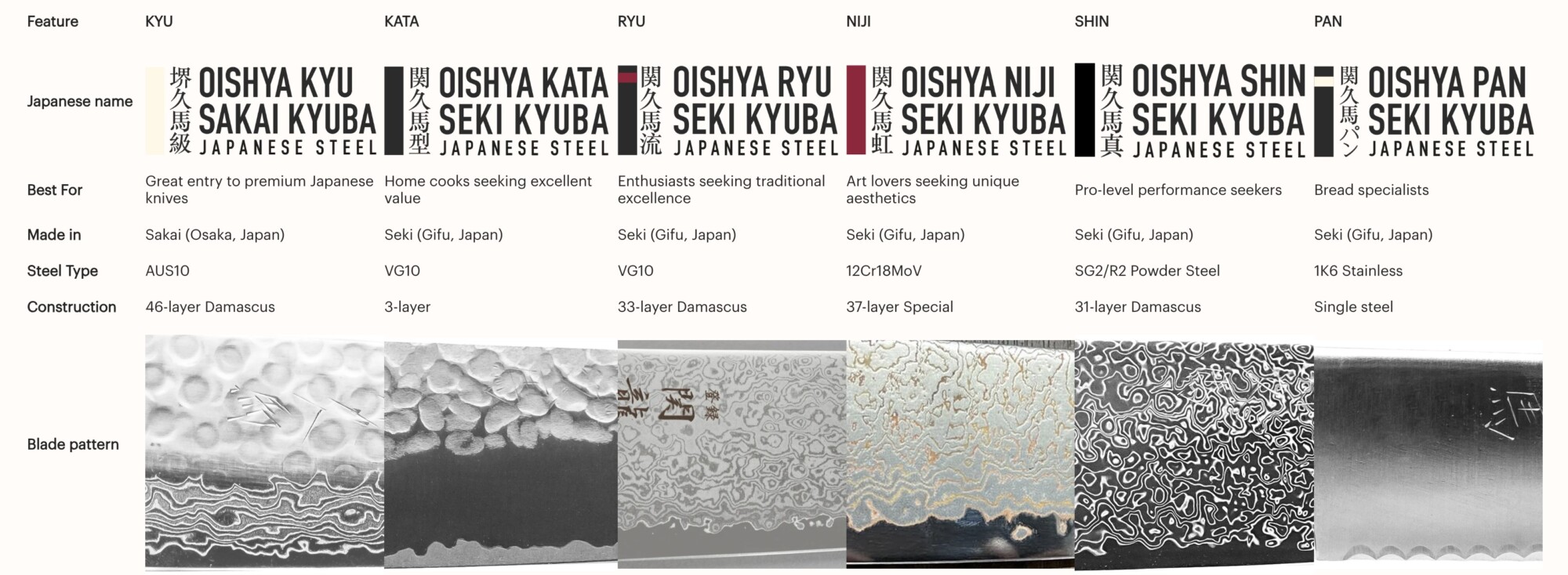
The karate belt system provided the perfect metaphor. Just as martial arts students progress through coloured belts before attempting black belt mastery, our knife lines represent distinct stages of culinary development. Each level builds on the previous one, adding complexity and performance whilst maintaining the fundamental principles learnt earlier.
This philosophy perfectly complemented Eva’s artistic vision. The onna bugeishas in our illustrations weren’t just decorative elements – they represented the journey of mastery that both martial artists and cooks undertake. Each knife line’s artwork shows these warrior women at different stages of their development, mirroring the customer’s own culinary journey.
KYU (級) – meaning “grade” or “class” – represents your entry into serious Japanese knife ownership. Like the solid foundation of coloured belts in martial arts, KYU offers genuine premium quality without overwhelming complexity. The AUS10 steel and 46-layer Damascus construction provide exceptional performance that will satisfy most home cooks for years.
Eva designed the KYU illustration strip to reflect this foundational concept. The artwork shows young onna bugeishas in training, learning basic techniques with determination and focus. The colours are warm but restrained, suggesting quality without pretension. Traditional Japanese elements like cherry blossoms and flowing water suggest the natural beauty that underlies all great craft. This is where your journey begins, and we wanted the packaging to feel welcoming rather than intimidating.
KATA (型) – meaning “form” or “pattern” – takes inspiration from the precise movements martial artists practise to perfect their technique. In karate, kata represents the bridge between basic techniques and fluid application. Our KATA knives embody this concept through their 3-layer construction where you can literally see the structure, understand the form.
The KATA illustration captures this development beautifully. Eva’s artwork shows onna bugeishas practising structured movements, their fans held in precise positions that suggest both grace and deadly efficiency. The visible core steel in our knives becomes reflected in the artwork’s emphasis on structure and form. We worked with Eva for months to create patterns that suggest both the precision of martial arts kata and the structural beauty of the knife’s construction. The colour palette steps up from KYU – more sophisticated, but still approachable.
RYU (流) – meaning “flow” or “style” – represents the point where technique becomes fluid, where conscious effort transforms into natural movement. Our 33-layer Damascus construction creates patterns that seem to flow like water across the blade surface. No two knives are identical because the Damascus patterns develop organically during the forging process.
Eva’s RYU packaging artwork emphasises this fluidity through flowing movement and dynamic composition. The onna bugeishas move like dancers, their fans creating swirling patterns that echo Hokusai’s Great Wave. Curved lines mirror the knife’s organic Damascus patterns, whilst the colour treatment suggests movement and depth. We experimented with dozens of design approaches before settling on illustrations that capture the sense of flow without becoming overly abstract. The challenge was creating static artwork that suggested dynamic movement – something Eva achieved brilliantly through her understanding of both Japanese art traditions and modern design principles.
NIJI (虹) – meaning “rainbow” – celebrates the artistry possible when traditional techniques meet creative vision. The 37 layers of steel, brass, and copper create genuinely unique patterns on every blade. The interaction between different metals during forging produces colour variations that shift with lighting and viewing angle.
This line presented the biggest packaging challenge because the knives themselves are so visually striking. How do you create illustration artwork that complements rather than competes with rainbow Damascus patterns? Eva ultimately developed artwork that uses the mythical significance of rainbows in Japanese culture – bridges between worlds, symbols of hope and transformation. Her onna bugeishas appear almost ethereal, surrounded by colour gradients that suggest the knife’s unique characteristics without overwhelming them. Each NIJI illustration strip includes subtle metallic highlights that catch light differently depending on viewing angle – a printing technique that reinforces the knife’s colour-shifting properties.
SHIN (真) – meaning “truth” or “essence” – represents mastery. This is our black belt equivalent, where SG2 powdered steel and 31-layer Damascus construction deliver performance that satisfies professional chefs. Everything about SHIN packaging needed to communicate uncompromising quality and refined aesthetics.
Eva’s SHIN artwork shows master onna bugeishas at the height of their powers – no longer students or even skilled practitioners, but teachers whose every movement embodies perfect technique. The packaging design reflects this pinnacle positioning through elegant restraint. The artwork is more sophisticated than previous lines but never ostentatious. We chose a colour palette that suggests premium quality without appearing flashy. Every design element reinforces the message that these knives represent the highest level of our craft.
PAN (パン) – written in katakana because it’s borrowed from Portuguese – acknowledges that even specialised tools deserve the same level of craft and attention. Bread may seem simple compared to complex knife work, but perfect bread requires perfect tools. The PAN line proves that specialisation and quality aren’t mutually exclusive.
Eva’s PAN packaging needed to communicate both specialisation and craftsmanship whilst fitting within our overall aesthetic narrative. She incorporated subtle references to bread’s cultural significance in Japan – the introduction of European baking techniques, the fusion of Eastern and Western culinary traditions. The onna bugeishas in the PAN artwork hold fans decorated with wheat patterns, suggesting how traditional Japanese artistry can adapt to embrace new purposes whilst maintaining its essential character.
Each illustration strip tells the story of its knife line whilst maintaining visual consistency across the entire range. We spent months working with Eva to ensure every design element reinforced the progression narrative whilst celebrating the individual character of each line. The result is packaging that functions as both protection and communication – each box tells you exactly what sort of tool you’re receiving and where it fits in your culinary development.
The hunt for perfect wood
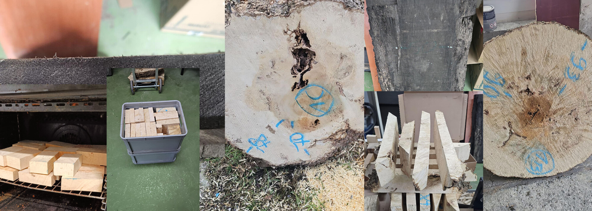
Walk into our wood selection area and you’ll understand why some of our knives take weeks to complete. We don’t just buy handle materials in bulk – we hunt for them individually, piece by piece.
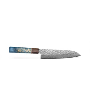
Maple burl forms when a tree experiences stress or injury, creating the wild, swirling grain patterns that make each handle unique. But finding burl with the right density, grain orientation, and visual impact requires examining hundreds of pieces. Most maple burl contains voids, internal cracks, or irregular density that would compromise long-term durability.
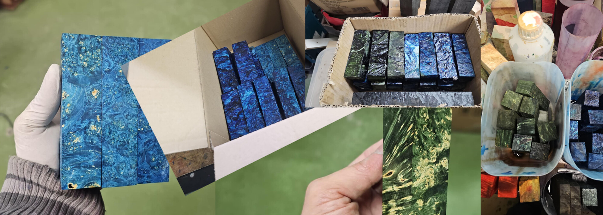
Our selection process starts with density testing using calibrated instruments. We use moisture metres to verify internal moisture content and perform density calculations to ensure each piece has the structural integrity needed for our lifetime guarantee. A beautiful piece of burl is worthless if it splits after six months of use.
Grain direction matters more than most people realise. The swirls and patterns need to run in orientations that resist splitting under stress. We’ve learnt to read grain patterns like geological surveys, identifying pieces where the grain flow will provide maximum strength in critical areas. Visual appeal comes last, after we’ve confirmed the wood can actually perform its job for decades.
The stabilisation process takes months and can’t be rushed. Raw burl goes into climate-controlled chambers where moisture content is slowly reduced to precise levels. Rush this process and the wood checks, warps, or develops internal stresses that cause failure later. We’ve learnt to budget 4-6 months from raw burl selection to finished handles, just for the drying and stabilisation phase.
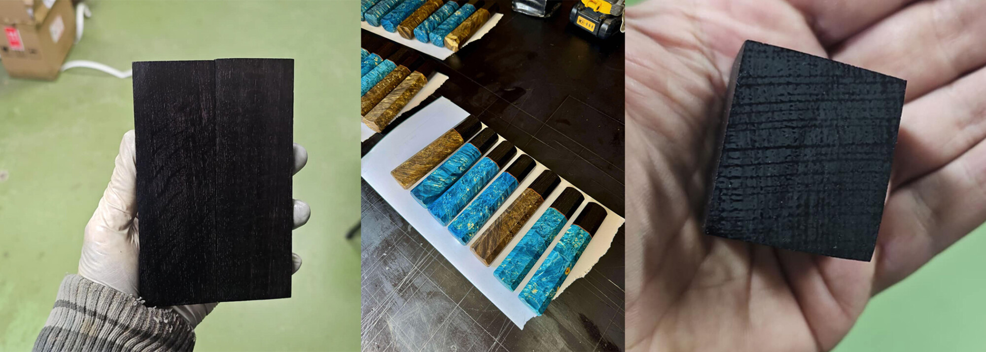
Temperature control during drying is critical. Too hot and the wood dries too quickly, causing stress cracks. Too cool and the process takes so long that mould or staining can develop. We maintain drying chambers at precisely controlled temperature and humidity levels, with computer monitoring that alerts us to any deviation from optimal conditions.
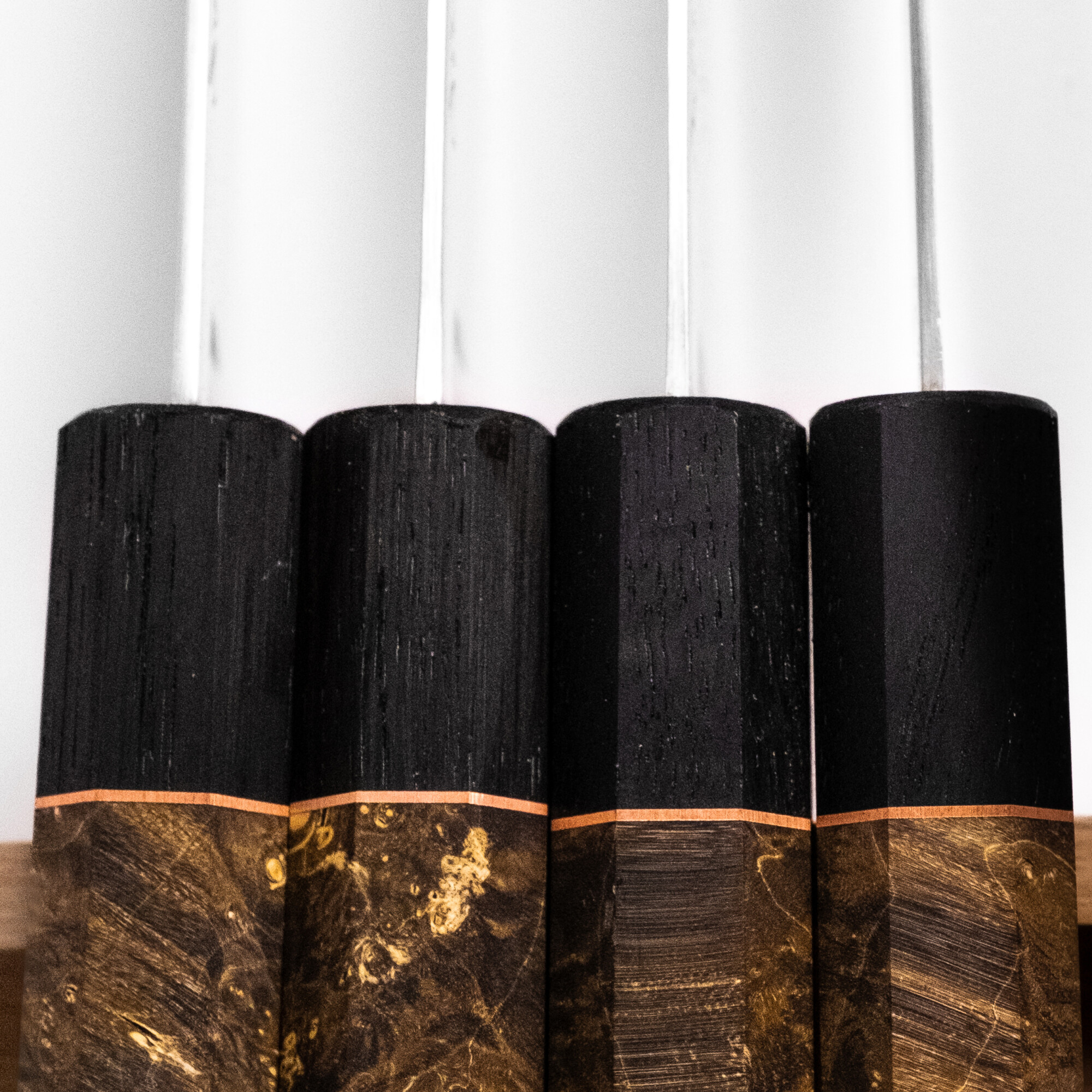
Bog oak presents completely different challenges. This wood spent thousands of years in peat bogs, where anaerobic conditions preserved and transformed it into something unique in the natural world. The peat environment removed moisture and replaced it with minerals, creating material that’s both ancient and incredibly stable.
But bog oak varies dramatically depending on which bog it came from, how long it was submerged, and the mineral content of its specific environment. We source from three different suppliers across Europe and test every batch for consistency. Some bog oak is too soft, lacking the mineral density needed for durability. Other pieces are so hard they’re difficult to shape without specialised carbide tools.
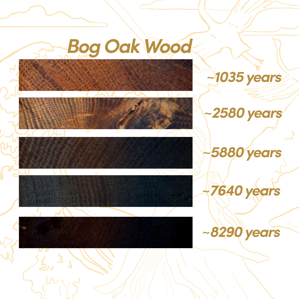
The selection process involves cutting test pieces from every batch, examining grain structure under magnification, and conducting stress tests on sample handles. We test for splitting resistance, impact tolerance, and dimensional stability under varying humidity conditions. Only about 30% of the bog oak we examine meets our standards for handle production.
Each piece of bog oak tells a story written in grain patterns and mineral deposits. Some pieces show clear growth rings from their original tree structure. Others display mineral staining that creates natural artwork within the wood. We’ve learnt to match wood character to knife personality – dramatic grain patterns for statement pieces, subtle figuring for knives that will see daily use.
Our three colour options – Mediterranean Blue, Olive Green, and Natural Brown – aren’t arbitrary aesthetic choices. Each represents a different stabilisation process that brings out specific characteristics in the wood grain whilst ensuring long-term stability.
The blue stabilisation process uses vacuum impregnation with specially formulated resins that enhance the flowing patterns in maple burl whilst adding depth to bog oak’s natural mineral streaks. The process takes 72 hours in vacuum chambers, followed by weeks of curing at controlled temperatures. The result complements Eva’s blue-toned artwork perfectly, creating visual harmony between handle and packaging.
The green stabilisation works particularly well with burl pieces that have complex figure patterns. The treatment penetrates deep into the wood structure, stabilising potential weak points whilst enhancing visual depth. This process requires precise timing – too short and the treatment doesn’t penetrate fully, too long and the wood becomes over-stabilised and loses its natural character.
Natural brown preserves the wood’s original character whilst providing maximum stability. This is often our most challenging colour to achieve because it requires stabilisation without visible colour change. The resins must penetrate completely whilst remaining essentially invisible in the finished handle.
Quality control for handle materials is exhaustive. Every finished handle undergoes stress testing, dimensional verification, and visual inspection under multiple lighting conditions. We reject approximately 8% of finished handles for aesthetic inconsistencies that wouldn’t affect performance but don’t meet our visual standards.
The Economics of Perfectionism
Here’s something most knife companies won’t tell you: the difference between “good enough” and “perfect” often costs more than the entire wholesale price of competing products. Every decision we make prioritises quality over cost efficiency, even when it seems financially irrational.
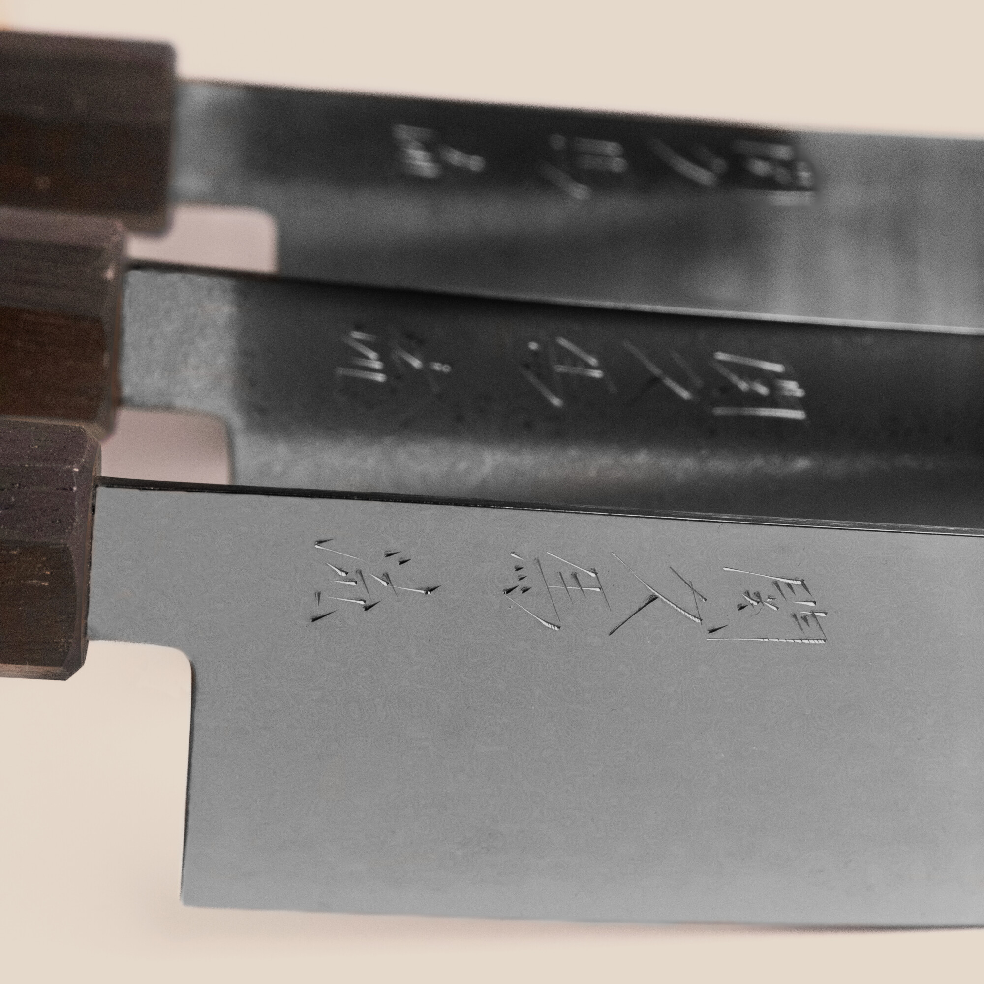
Take our hanko seals. Each craftsman has their personal seal that goes on every knife they forge. We could use machine engraving, laser etching, or stamped impressions to apply these marks quickly and cheaply. Instead, each seal is hand-pressed into the tang using traditional techniques that require skill, time, and careful attention to positioning and depth.
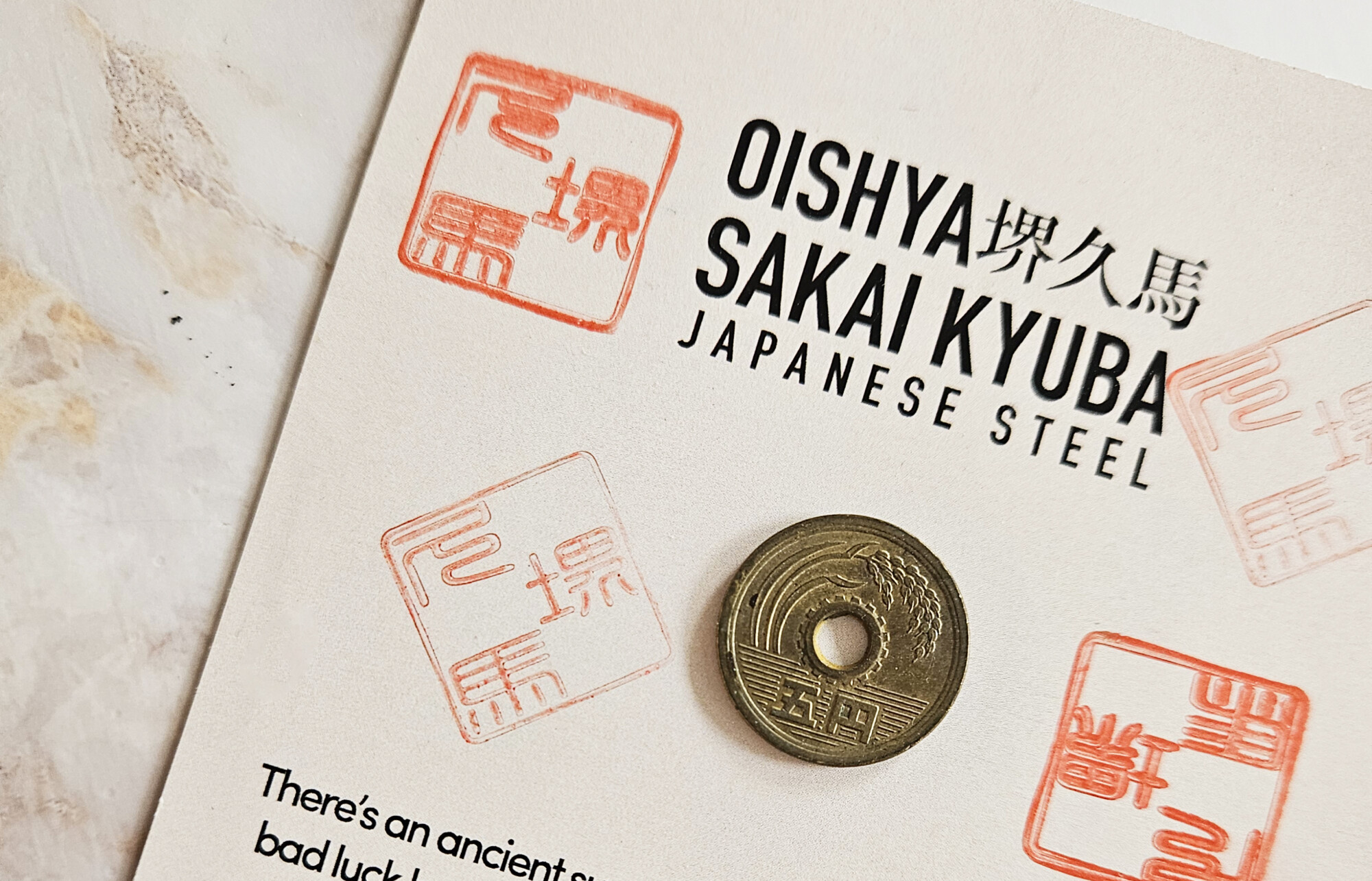
This hand-pressing process adds approximately 15 minutes to each knife’s production time. Multiply that across thousands of knives annually, and we’re talking about hundreds of hours of skilled craftsman time dedicated to a detail that doesn’t affect cutting performance. But it maintains the human connection between craftsman and user that mass production destroys.
The 5 yen coins included with every knife represent another “unnecessary” expense that we consider essential to the complete experience. These aren’t random coins pulled from circulation. We source them specifically for condition, date ranges, and symbolic appropriateness. Each coin is inspected, cleaned if necessary, and positioned precisely within the packaging alongside Eva’s illustration strips.
A small detail that costs almost nothing individually but adds up across thousands of knives annually. More importantly, it adds up in customer experience. The coin connects your modern kitchen to centuries of Japanese tradition about tools, respect, and the spiritual aspect of cooking.
Eva’s custom artwork for each knife line represents a significant investment that most companies would consider unnecessary. We could have used stock illustrations or simple graphic designs. Instead, we commissioned original artwork that tells our story whilst honouring Japanese cultural traditions. The result is packaging that customers often keep long after unboxing, transforming functional protection into decorative art.
Our quality control process rejects approximately 12% of finished knives for minor aesthetic issues that wouldn’t affect performance in any measurable way. A slightly uneven Damascus pattern that’s still beautiful but not quite perfect. A handle colour that doesn’t precisely match our standards despite being gorgeous in its own right. A hanko seal that’s positioned 2mm off centre but still clearly visible and properly impressed.
These knives work perfectly and would satisfy most customers completely. But they don’t meet our internal standards for what an Oishya knife should be. Rather than sell them as seconds or discount them as imperfect, they’re sold to staff at cost or donated to culinary schools. The cost of this perfectionism is significant, but the cost of compromising our standards would be higher.
This level of obsessive attention to detail only works economically because we control the entire chain from forge to customer. Traditional retail markup structures would make our knives unaffordable if we had to account for distributor margins, retailer markups, and traditional marketing costs.
A knife that costs us £200 to produce might wholesale for £280, retail for £420, and sell for £500 after markups. By selling direct, we can invest that £200-300 difference back into quality whilst maintaining prices that deliver genuine value to customers.
Compare our SHIN line gyuto to equivalent knives from established Japanese brands sold through traditional retail channels. You’ll find similar steel specifications, similar construction techniques, similar craftsmanship levels – often from the same workshops in Seki – selling for 40-60% more than our prices.
The difference isn’t quality, reputation, or even marketing costs. It’s business model. Traditional brands optimise for retail markup structures and distributor relationships. We optimise for customer experience and product quality, accepting lower margins in exchange for direct customer relationships and complete control over quality standards.
The Weight of Expectations
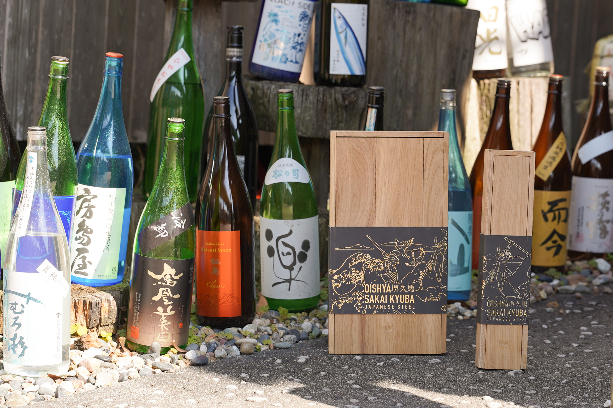
Every detail in your unboxing experience has been obsessed over, tested, and refined through countless iterations. The way the wooden box opens with just the right resistance – not so easy that it feels cheap, not so difficult that it’s frustrating. The positioning of Eva’s illustration strip so you see it at exactly the right moment in the unboxing sequence. The weight distribution that makes the knife feel substantial but not heavy when you first lift it from its box.
We’ve actually timed the unboxing sequence during customer testing sessions. From initial box opening to first knife touch takes an average of 47 seconds if you stop to read Eva’s illustration strip, 23 seconds if you skip directly to the knife. We know this because we’ve watched hundreds of customers unbox their knives and timed every step of the process.
The small foam separator between knife and handle exists because we discovered that even with perfect box dimensions, shipping vibrations can cause microscopic movement that affects the knife’s initial presentation. The blade might shift slightly, causing the handle to rest at an odd angle when you first open the box. That tiny piece of foam – which costs us about £0.03 per knife – prevents positioning issues that would compromise your first impression.
Eva’s illustration strip attachment method went through seven iterations before we achieved the right balance of security and removability. Too permanent and customers couldn’t remove it without damaging the box. Too temporary and strips would detach during shipping, leaving adhesive residue on the oak wood and potentially damaging the artwork. The current system uses a specialised adhesive that holds firmly during shipping but releases cleanly when you’re ready to remove it, preserving both the box and Eva’s artwork.
Even the box opening direction was debated extensively. Should the lid lift off the top, or should the box open like a book? Top-lifting provides better initial knife presentation and allows Eva’s artwork to be seen at the optimal moment, but requires more table space during unboxing. Book-style opening works better in cramped spaces but doesn’t create the same dramatic reveal moment. We ultimately chose top-lifting because the dramatic reveal better matches the significance of the purchase and showcases Eva’s artwork more effectively.
The wooden box construction itself required extensive engineering to achieve the right balance of protection, weight, and cost. The wood thickness needed to protect contents during shipping without making boxes prohibitively heavy. Corner joints had to be strong enough to survive rough handling but simple enough to manufacture consistently. The interior dimensions required precision to prevent knife movement without constraining the contents unnecessarily.
We tested boxes by shipping them to ourselves repeatedly, subjecting them to various shipping conditions and carriers. Some early versions arrived with loose joints after multiple shipping cycles. Others developed stress cracks at corner connections where Eva’s illustration strips attached. The current design has survived hundreds of test shipments without structural failure whilst maintaining the visual integrity of the artwork.
The Invisible Details
This is the reality behind that simple brown shipping box arriving at your door. Months of engineering decisions you’ll never see. Hundreds of prototypes you’ll never know existed. Thousands of measurements that ensure your first impression matches our intentions.
Our fulfilment partners use only biodegradable, sustainable materials throughout the shipping process – no plastic where possible, with paper filling gaps so products don’t bounce in shipping boxes. Even the outer packaging materials were chosen to align with our commitment to natural materials and environmental responsibility. The cardboard shipping box dimensions are optimised to minimise movement during transport whilst maximising shipping efficiency.
We track damage rates across different shipping carriers and routes, adjusting packaging accordingly. Boxes shipped to certain regions receive additional protective wrapping because we’ve identified higher damage rates on those routes. International shipments get supplementary cushioning because they typically experience more handling stages that could affect Eva’s delicate illustration strips.
The Certificate of Authenticity included with each knife contains security features that prevent counterfeiting whilst maintaining the aesthetic integrity of the document. The paper stock, printing methods, and hanko seal application are all designed to provide verification whilst feeling appropriate to the product’s quality level and complementing Eva’s artistic vision.
But here’s what we’ve learnt after all those prototypes, failed experiments, and obsessive attention to details: customers always notice quality, even when they can’t articulate exactly what makes one experience better than another. They might not know why their knife feels more substantial than expected, why the box construction seems more solid, or why every element feels intentionally chosen rather than randomly assembled. They certainly notice Eva’s artwork – many customers tell us they’ve kept the illustration strips as decorative pieces long after unboxing.
When you open your Oishya knife, you’re not just receiving a tool. You’re experiencing the culmination of countless decisions made by people who believe your cooking deserves the same level of care and attention that we put into every aspect of our craft. You’re also connecting with the artistic vision of Eva, whose illustrations transform functional packaging into cultural storytelling.
The next time you reach for your knife, remember: it arrived in a box that took eighteen tries to perfect, wrapped with materials chosen over months of testing, adorned with artwork that honours centuries of Japanese tradition, sealed with a hanko pressed by hand, and packaged by people who have probably spent more time thinking about your unboxing experience than you’ll spend actually unboxing it.
This is what obsession looks like when it serves a purpose. This is why your knife feels different from the moment you first hold it. This is why we changed our name from Japana to Oishya – because we’re not just selling products from Japan anymore. We’re creating experiences that honour the joy of cooking, the artistry of tradition, and the stories that connect us all through food, regardless of where the individual components happen to be made.
This is Oishya.
Handcrafted Japanese Knives by Oishya
Forged by master craftsmen in Seki and Sakai, Japan. Free shipping worldwide • 100-day money-back guarantee • Lifetime warranty
